
Text-to-Chart
Turn data into a chart in one go
VORA Chat and Tool Demo
Text-to-Chart — workflow demo
Turn data into a chart in one goChoose a real request from this guide and preview the flow from input to result.
This demo stays in your browser; it sends, saves, and charges nothing.
Send a request to see the processing flow and output format for this tool.
Show Tesla’s revenue for the last four years as a bar chart
- 1Extract values
- 2Structure chart data
- 3Render visualization
- 4Check interactions
VORA chat inputShow Tesla’s revenue for the last four years as a bar chart
- 1Natural language + values
- 2Structured chart data
- 3Interactive chart
ⓘ If no chart type is requested, the tool selects one suited to the data.
1Key comparison
2Change or trend
3Notable value
Live results vary with the source material, request, and time of use.
What is the Text-to-Chart tool?
A tool that visualizes data as charts.
When you enter numeric data you want to organize, it creates a visualized chart page with bar graphs, line graphs, pie charts, and more.
※ For infographic-style visualizations, please use the "Text-to-Infographic" tool instead.
When can you use it?
The Text-to-Chart tool is especially useful in these situations.
- When you want to visually compare numeric data
- When you need charts for presentations
- When you want to compare statistics for multiple companies or items at a glance
- When you want to visually express trends
For example, you can naturally ask "Draw a market cap comparison chart of the 5 US Big Tech companies", "Create a monthly revenue chart from January to June", or "Organize major social media platform user counts as a chart". The AI will then use this tool to generate the result.
What charts can you make?
You can make many types of charts depending on your goal. Use this "for this, use this chart" guide.
① Comparison — comparing sizes across items
A bar chart is the most intuitive. Grouped bar, stacked bar, pyramid, lollipop, bar table, dumbbell, waterfall, and bullet charts are also available.
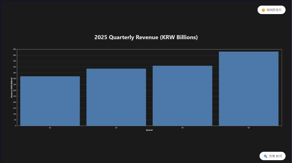
Example: "Show 2025 quarterly revenue as a bar chart. Q1 420B, Q2 485B, Q3 510B, Q4 630B (KRW)"
② Trend — change over time
A line chart shows the flow at a glance. Area, streamgraph, range area, sparkline, bump, slope, and combo charts are also available.
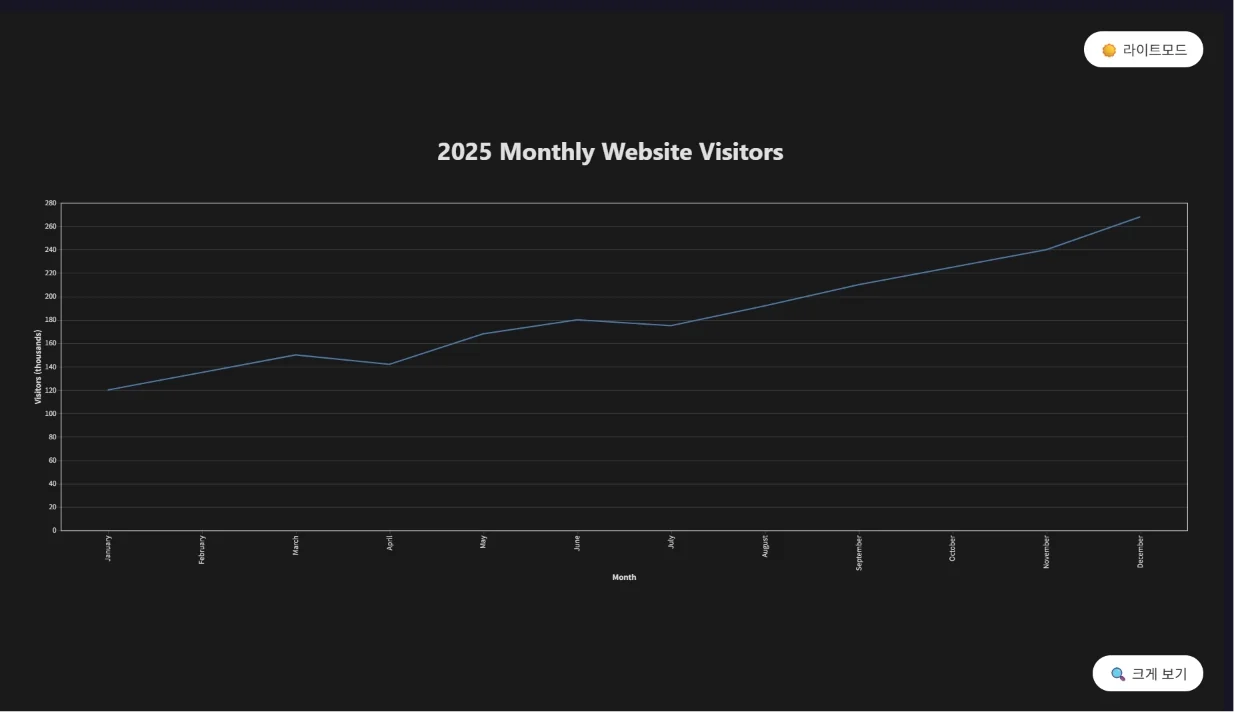
Example: "Draw 2025 monthly website visitors as a line chart. Jan 120K, Feb 135K, Mar 150K, Apr 142K, May 168K, Jun 180K, Jul 175K, Aug 192K, Sep 210K, Oct 225K, Nov 240K, Dec 268K"
③ Proportion — part-to-whole composition
A pie chart expresses share. Doughnut, rose, treemap, sunburst, and funnel charts are also available.
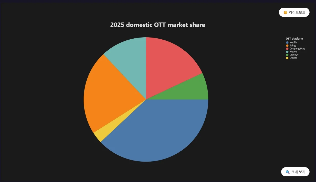
Example: "Show 2025 domestic OTT market share as a pie chart. Netflix 38%, Tving 22%, Coupang Play 18%, Wavve 12%, Disney+ 7%, Others 3%"
④ Correlation & distribution — relationship between two values or how data is spread
A scatter plot reveals correlation. Regression, connected scatter, bubble, histogram, density, ECDF, boxplot, violin, strip, and parallel coordinates charts are also available.
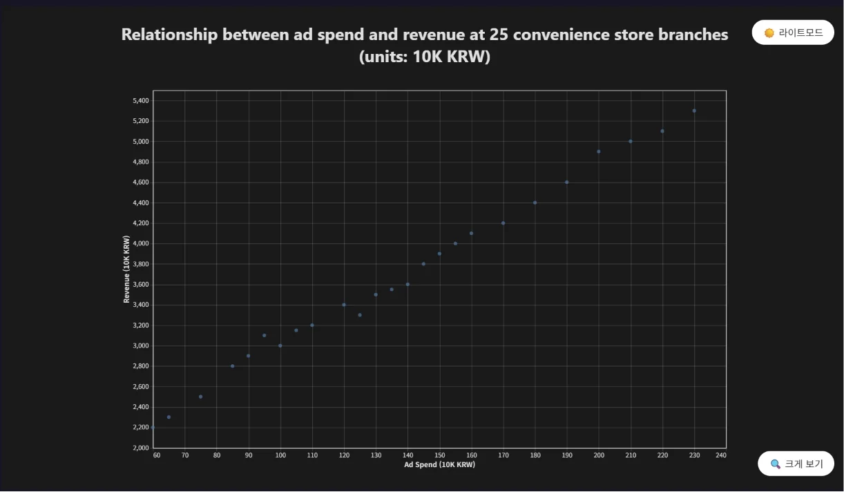
Example: "Draw the relationship between ad spend and revenue at 25 convenience store branches as a scatter plot. (ad spend, revenue in 10K KRW) (120, 3400), (85, 2800), (200, 4900), (150, 3900), (95, 3100), (170, 4200), (60, 2200), (230, 5300), (140, 3600), (110, 3200), (190, 4600), (75, 2500), (160, 4100), (130, 3500), (210, 5000), (100, 3000), (180, 4400), (90, 2900), (145, 3800), (125, 3300), (65, 2300), (220, 5100), (155, 4000), (105, 3150), (135, 3550)"
⑤ Time series — stock or price movement
A candlestick chart shows open, high, low, and close together. Calendar heatmap and Gantt charts are also available.
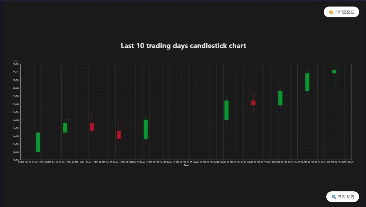
Example: "Draw the last 10 trading days as a candlestick chart. (date: open/high/low/close) 6/29: 71000/72500/70800/72200, 6/30: 72200/73100/71900/72800, 7/1: 72800/73500/72000/72300, 7/2: 72300/72900/71500/71800, 7/3: 71800/73200/71700/73000, 7/6: 73000/74500/72800/74200, 7/7: 74200/74800/73500/73900, 7/8: 73900/75000/73700/74800, 7/9: 74800/76200/74600/75900, 7/10: 75900/76500/75200/76100"
⑥ Relationship & flow — flows or connection structures
A Sankey diagram expresses the volume of flow. Heatmap, network graph, and tree diagrams are also available.
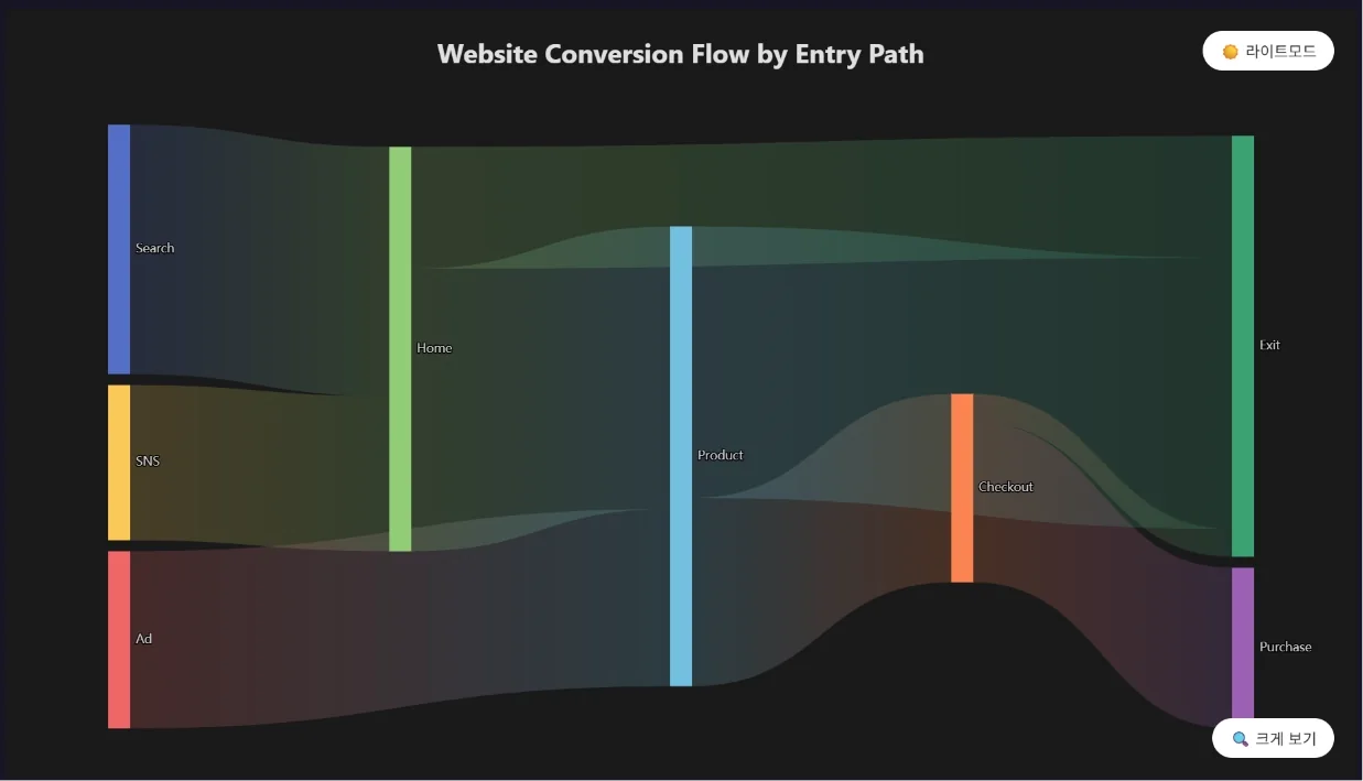
Example: "Show website conversion flow by entry path as a Sankey diagram. Search → Home 4500, SNS → Home 2800, Ad → Product 3200, Home → Product 5100, Home → Exit 2200, Product → Checkout 3400, Product → Exit 4900, Checkout → Purchase 2900, Checkout → Exit 500"
⑦ KPI — summarizing key numbers
A KPI card shows performance against targets. Gauge and radar charts are also available.
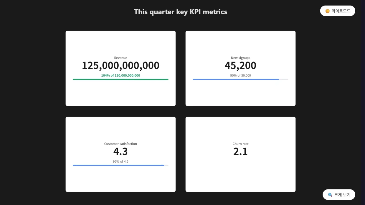
Example: "Show this quarter's key metrics as KPI cards. Revenue 125B (target 120B), new signups 45200 (target 50000), customer satisfaction 4.3 (target 4.5), churn rate 2.1%"
⑧ Map — data by region
A choropleth expresses regional values by color. Bubble maps are also available, and it supports Korea province/municipality, world countries, US states, and provinces/prefectures of major countries.
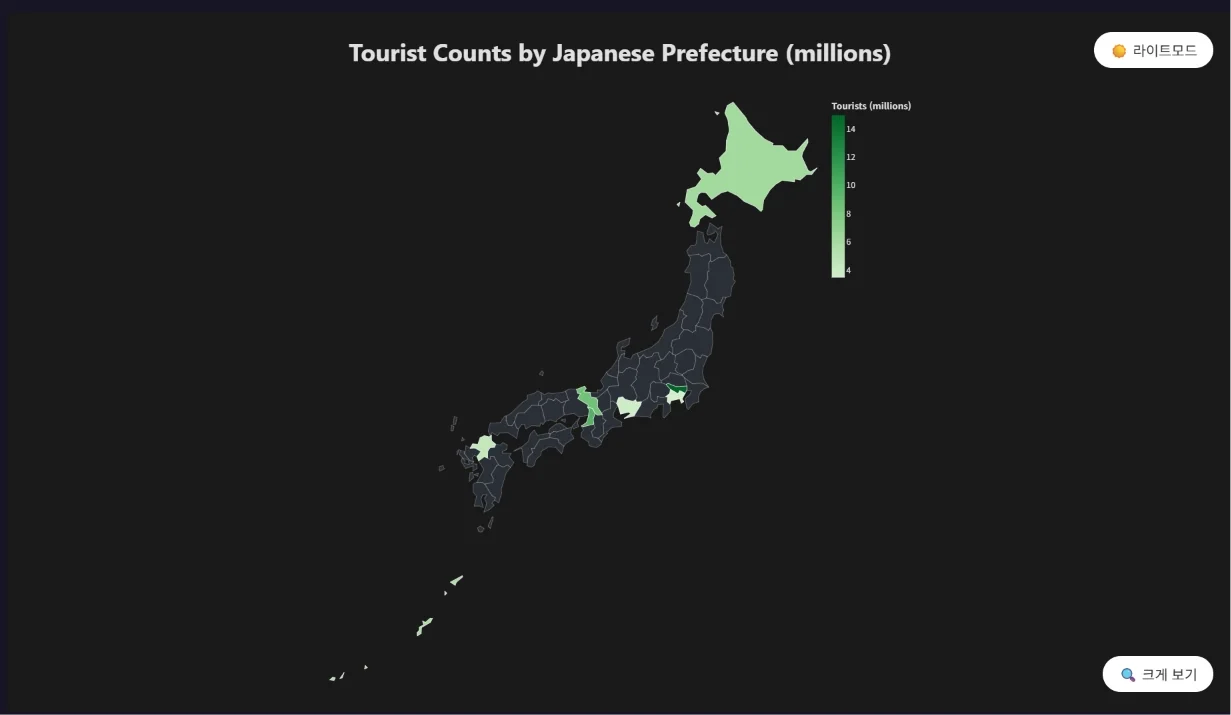
Example: "Show tourist counts by Japanese prefecture as a choropleth map of Japan. Tokyo 15M, Osaka 9.8M, Kyoto 8.5M, Hokkaido 6.2M, Okinawa 5.8M, Fukuoka 4.5M, Aichi 3.8M, Kanagawa 3.5M"
How to use it
Usage is simple. Just enter your request naturally in the input box like this.
[Data to compare · visualize] + Chart + [Generation expression]
Here are some examples:
- Size comparison (bar): "Draw a market cap comparison chart of the 5 US Big Tech companies"
- Change over time (line): "Create a monthly revenue chart from January to June"
- Composition (pie): "Organize domestic OTT market share as a pie chart"
- Key metrics (KPI): "Show this quarter's revenue, signups, and satisfaction as KPI cards"
- By region (map): "Show population by province on a map of Korea"
Practical request checklist
For a stronger Text-to-Chart request, state the goal, input, scope, and output format together. Adding one more layer of constraints beyond the basic examples reduces follow-up questions and makes the result easier to use.
- Start with the deliverable’s purpose, audience, language, and real use case.
- Separate required source material, figures, and wording from content to exclude.
- Set the file type, length, outline or columns, visual tone, and definition of done.
Review, save, and reuse the result
Treat the Text-to-Chart result as a draft or a snapshot taken at query time. Check the following before carrying it into the next task.
- Confirm that titles, structure, tables, and figures follow the request and source material.
- Before publishing, review spelling, copyright, personal data, and brand usage.
- For revisions, name the page, paragraph, or cell and the exact change instead of regenerating everything.